PROJECT NAME:
NIMBLE
WHAT:
QUICK COMMERCE GROCERY APP
YEAR:
2024

Where speed meets inspiration
An experience that blends instant delivery with guided cooking inspiration—making every step feel considered.


the challenge.
Quick-commerce grocery apps are designed for speed — yet often slow users down.
Large product catalogues require users to browse, compare and assemble items across multiple categories, turning simple decisions into time-consuming tasks.
The challenge was to explore how a recipe-driven experience could provide a clearer starting point and reduce friction from inspiration to checkout.
project overview.
Defining the concept, scope, and direction of the project.
The project explores how a focused quick-commerce grocery service could simplify everyday meal planning. Building on existing insights into customer needs and market gaps, I analysed leading delivery apps to understand their navigation structures, interaction patterns, and visual language.
These insights informed the concept direction and design decisions throughout the project. From early wireframes defining the core journeys to the creation of a structured design system, the work gradually evolved into a high-fidelity concept demonstrating a cohesive and intuitive user experience.
the process.
From research and concept definition to high-fidelity UI design.
The design process moved from market analysis and concept definition to wireframing, visual direction, and high-fidelity UI design. Each phase helped refine the experience and translate insights into a clear product concept.

market insights.
Understanding how existing quick-commerce services structure navigation, interaction patterns, and product discovery.
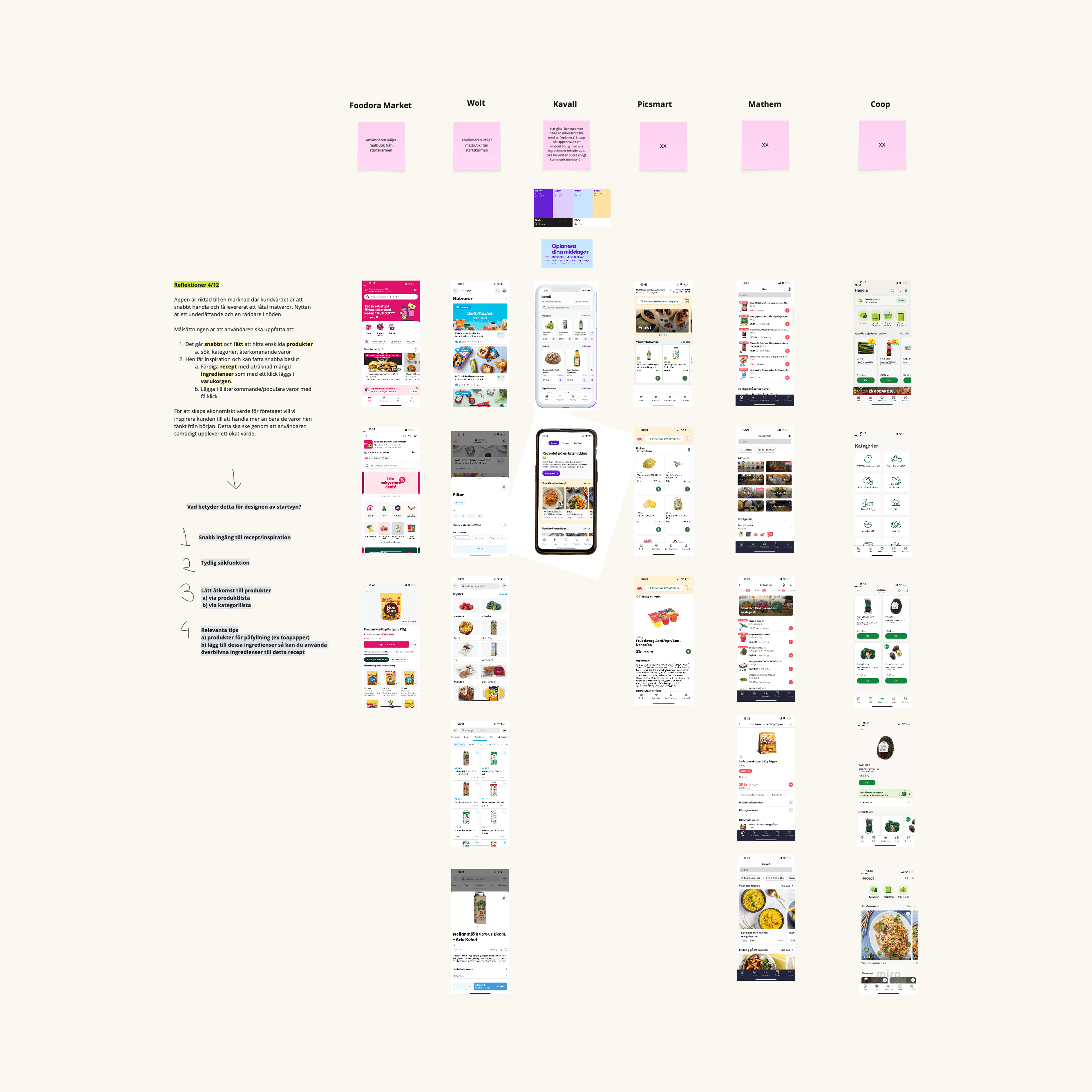
I conducted a market analysis of similar services, examining navigation structures, visual design, USPs, and interaction flows to identify patterns and opportunities for differentiation.
Key insight
Most quick-commerce apps prioritize large product catalogues and category browsing. This often increases decision time when users are simply trying to decide what to cook.
This insight led to a recipe-first concept, allowing users to discover meals and add the required ingredients to their basket in one flow.
competitors
Understanding positioning, feature sets, and visual approaches across leading quick-commerce services.

patterns
Identifying recurring UI and interaction patterns that shape user expectations.
navigations
Exploring how users browse, search, and access products in existing delivery apps.

design language.
Defining the visual identity and product expression.
To shape a product experience that feels fresh, trustworthy, and contemporary, the visual identity for Nimble was built around simplicity, quality, and a modern aesthetic. The service name was developed to reflect speed and flexibility — capturing the idea of a grocery experience that moves effortlessly with everyday life.
The color palette draws from earthy tones to evoke a sense of natural balance and food quality, while a clean, modern typeface communicates clarity and accessibility. Together, these elements form a cohesive design language that supports a calm, intuitive shopping experience.
outcome.
A high-fidelity concept demonstrating a fast, recipe-driven grocery experience.
The project resulted in a high-fidelity concept covering the app’s primary screens and key ordering flows. The design translates market insights and concept direction into a clear, recipe-driven grocery experience focused on speed, simplicity, and everyday inspiration.
While developed as a conceptual exploration, the outcome provides a foundation for a potential product. With further user testing, the flows and content could be refined, followed by expanding the design system and designing the remaining screens for a full-scale implementation.
Outcome highlights
Recipe-first browsing helps users quickly decide what to cook instead of navigating large product catalogues.
Flexible ingredient management allows users to add, remove, or adjust items before checkout.
Shallow navigation flows reduce the number of steps between inspiration and completed order.


testimonial.
An exceptionally well-executed project.
From packaging to final UI, every detail feels considered, with strong layout, confident colour use, and a clear sense of design maturity.

Martin Holeby Saint Cyr
Co-Founder Flatwave & UI Design Teacher, Nackademin